Design Impact Studio
If you'd like to talk about our brand online, simply get some inspo or even kindly do some promo for us then here's everything you need to know.
If you'd like to talk about our brand online, simply get some inspo or even kindly do some promo for us then here's everything you need to know.
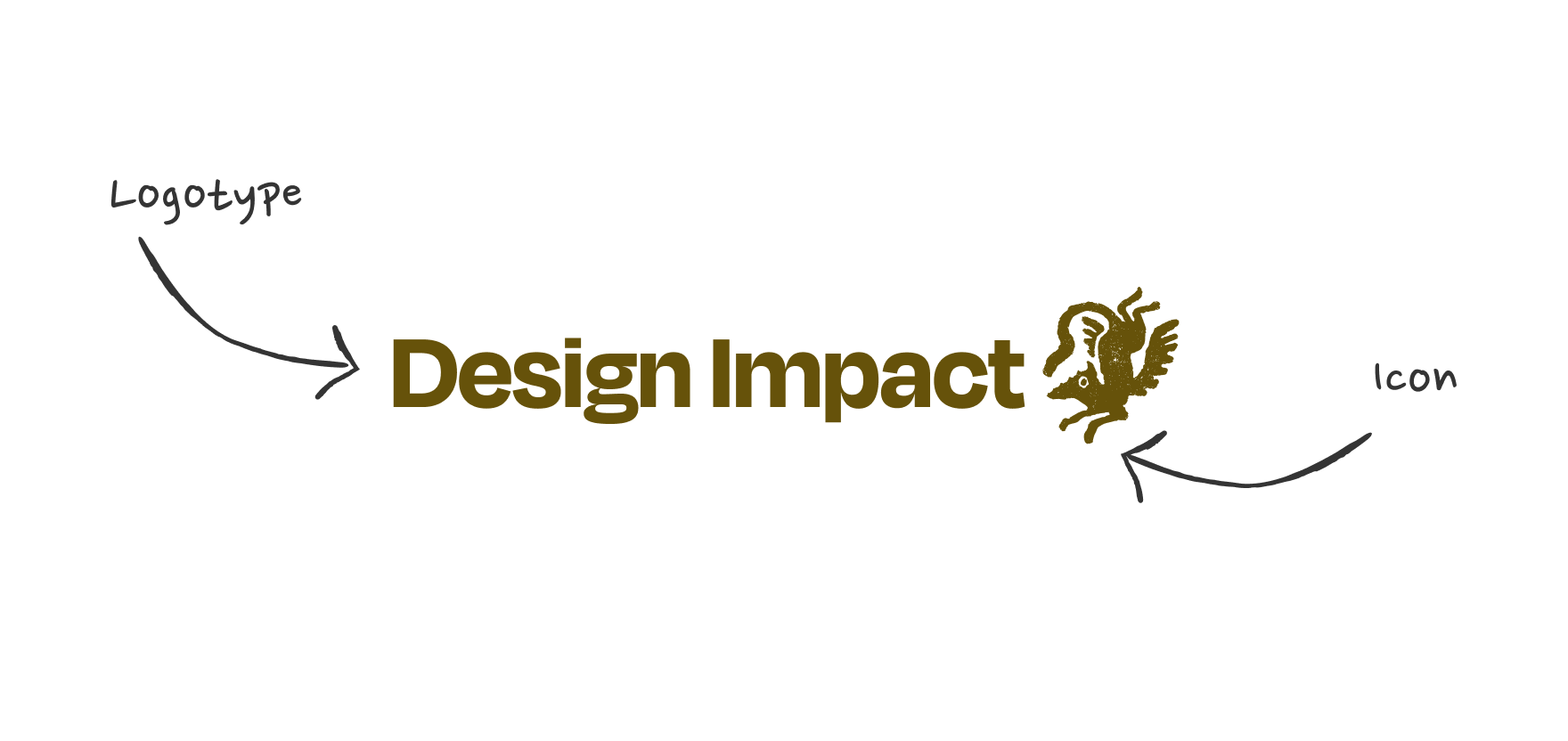
The Design Impact Studio logo is made up of two parts: the icon and the logotype. These can be used together as a full logo or separately, depending on the context. The icon works well at smaller sizes or where space is limited, while the full logo is ideal for more prominent placements.
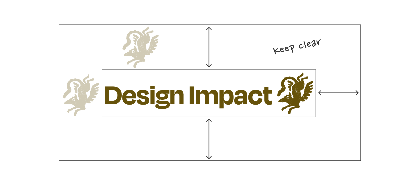
The logo should be given sufficient minimum spacing around it wherever it is placed. You can use the size of the logo icon as a guide.
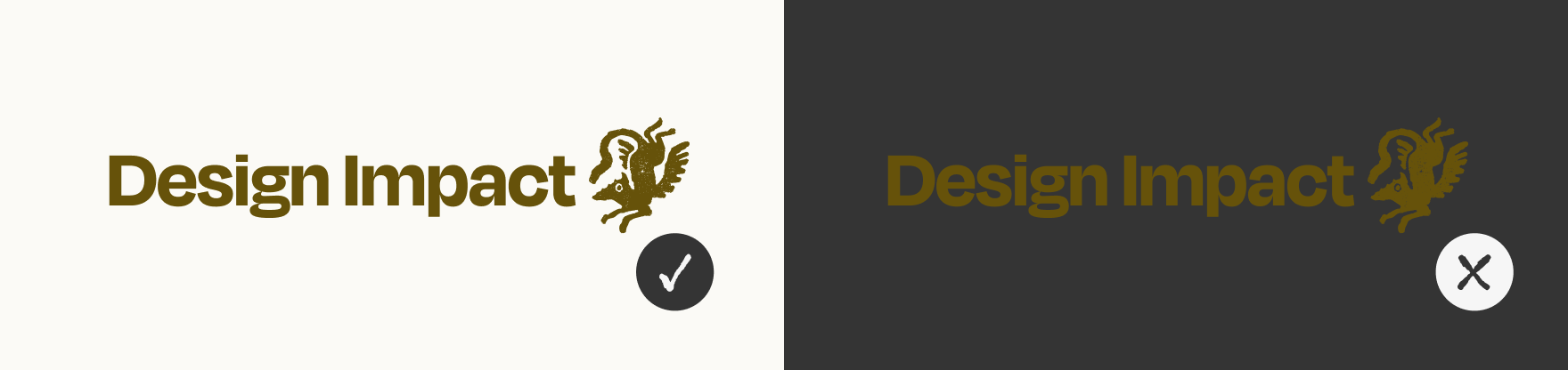
Always use the logo on the background colour it was intended for.
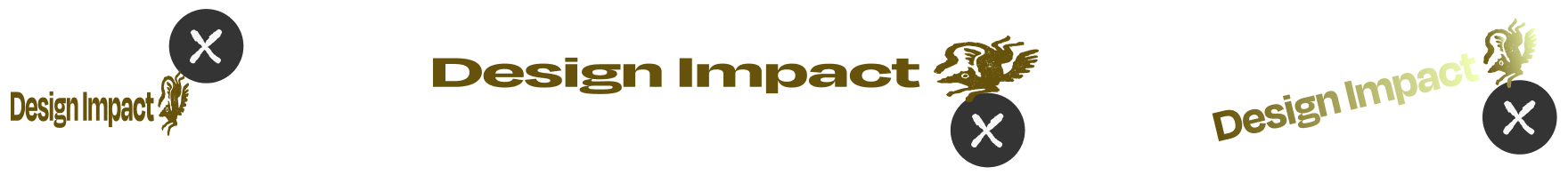
Don’t change the logo by stretching, squashing or doing anything weird to it.
Download the full logo, the logotype and the logo icon here.
Degular - Medium to Semi-Bold
Degular - Regular
This is the body font for Design Impact Studio, to be used for smaller type and longer sections of text, like articles or longer paragraphs that aren’t being highlighted in some way.
These are the main colours used in the Design Impact Studio brand. Dark gold reflects steadiness and keeps things grounded, and the soft, off-white background colour is warm and friendly. Overall, the palette is thoughtful and balanced rather than flashy and noisy, just like us! Whilst the zesty yellow adds a spark - moments of energy, possibilities, and growth.
You can click on the hex codes to copy them to your clipboard.
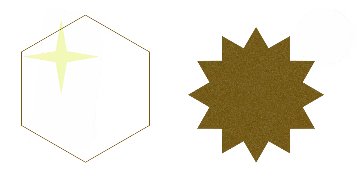
Our graphics are an important part of expressing the Design Impact Studio brand. Text shouldn’t be placed over the images.
Our tone of voice is kind, grounded and expert. We speak with clarity and warmth, creating space for people to feel held, empowered and understood.We avoid jargon, ego or over-promising. The tone should feel calm, confident and human - like a trusted guide who brings focus, care and a clear path forward.
We balance empathy with insight. Our language reflects the way we work: values-led, collaborative, and committed to real-world impact.
In short:
→ Warm, steady and human
→ Clear and considered
→ Empowering, not overwhelming
→ Purposeful, practical and grounded in care